Fraunces and Karla for warm, friendly brands
A soft, old style serif with a bit of wobble, and a friendly grotesque for the words around it. Good for bakeries, shops and anything that should feel made by hand.
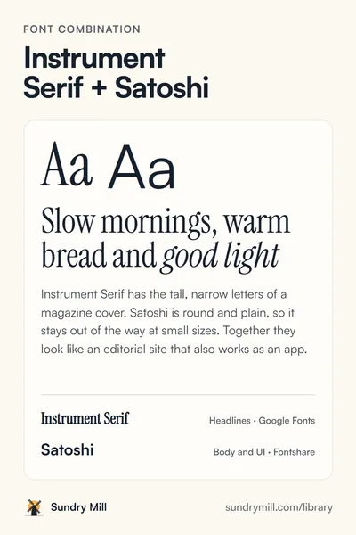
Font combination
Fraunces + Karla
Fresh bread, every morning
Fraunces is a soft serif with optical sizes, so its big headlines get tighter and more characterful while small text stays sturdy. Karla is a friendly grotesque with a slightly quirky shape, easy to read in menus, prices and buttons.
FrauncesHeadlines · Google Fonts
KarlaBody and UI · Google Fonts
The two fonts
-
Fraunces
-
Karla
At different sizes
Fresh bread, every morning
Fresh bread, every morning
Fraunces is a soft serif with optical sizes, so its big headlines get tighter and more characterful while small text stays sturdy. Karla is a friendly grotesque with a slightly quirky shape, easy to read in menus, prices and buttons.
Label · Button · 0123456789
Add them to a site
<link rel="preconnect" href="https://fonts.googleapis.com">
<link rel="preconnect" href="https://fonts.gstatic.com" crossorigin>
<link href="https://fonts.googleapis.com/css2?family=Fraunces:opsz,wght@9..144,400..800&family=Karla:wght@400;500;700&display=swap" rel="stylesheet">h1, h2, h3 {
font-family: 'Fraunces', Georgia, serif;
font-weight: 700;
font-optical-sizing: auto;
line-height: 1.05;
letter-spacing: -0.02em;
}
body {
font-family: 'Karla', system-ui, sans-serif;
font-size: 1.0625rem;
line-height: 1.6;
}
button { font-family: 'Karla', system-ui, sans-serif; font-weight: 700; }How to use it
- Let Fraunces run at 700 or 800 for headlines. Its optical size axis tightens the letters at large sizes on its own when font-optical-sizing is auto.
- Karla at 400 for body text and 700 for buttons and prices. It pairs with Fraunces because both have round, open shapes.
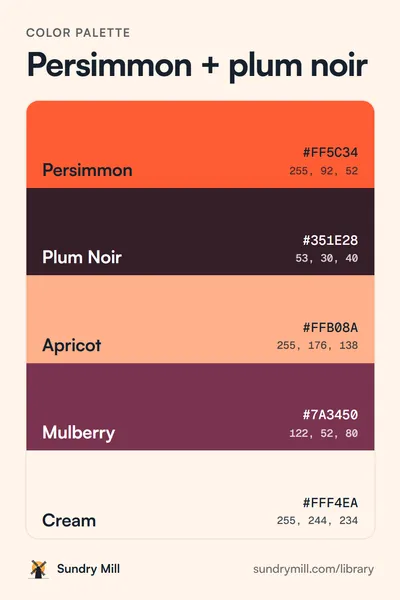
- Warm colours suit this pair. Try it with the autumn palette.
Free to use in personal and commercial work. No credit needed, though a link back is always nice.