Persimmon and Plum Noir: warm orange with deep plum
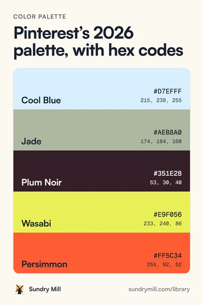
Pinterest pairs Persimmon with Plum Noir for mystery with warmth. Three softer shades make it usable for a whole page.
Color palette
Persimmon + plum noir
255, 92, 52
53, 30, 40
255, 176, 138
122, 52, 80
255, 244, 234
The 5 colours
-
Persimmon
From the 2026 Pinterest Palette.
-
Plum Noir
From the 2026 Pinterest Palette.
-
Apricot
Ours: a soft orange for large areas.
-
Mulberry
Ours: between the plum and the orange.
-
Cream
Ours: a warm white.
Copy them all
:root {
  --persimmon: #FF5C34;
  --plum-noir: #351E28;
  --apricot: #FFB08A;
  --mulberry: #7A3450;
  --cream: #FFF4EA;
}@theme {
--color-persimmon: #FF5C34;
--color-plum-noir: #351E28;
--color-apricot: #FFB08A;
--color-mulberry: #7A3450;
--color-cream: #FFF4EA;
}#FF5C34, #351E28, #FFB08A, #7A3450, #FFF4EAText that reads
Pairs from this palette that pass WCAG AA contrast for body text (4.5:1 or more).
- Plum Noir on Cream14.2:1 AAA
- Plum Noir on Apricot8.6:1 AAA
- Mulberry on Cream8.0:1 AAA
- Plum Noir on Persimmon5.0:1 AA
- Mulberry on Apricot4.9:1 AA
In use
How to use it
- Plum Noir on Cream is the reading pair. Persimmon is the call to action, with Plum Noir text on it.
- Apricot fills big areas where Persimmon would be too much, like a hero band or a card.
- Mulberry links the two: use it for hover states, secondary headings and illustration shadows.
Making a music or podcast clip? Wayvl takes a wave colour and a background colour, so two of these codes are all it needs.
Persimmon (#FF5C34) and Plum Noir (#351E28) are from Pinterest’s 2026 Pinterest Palette, which pairs them as its Persimmon-Plum sub palette. Apricot, Mulberry and Cream are our additions. Sundry Mill is not connected to Pinterest.
Free to use in personal and commercial work. No credit needed, though a link back is always nice.