Courier Prime and Instrument Serif, a typewriter font combination
A typewriter face for the words and a fine serif for the titles. It looks like a poem someone typed and then framed.
Font combination
A poetcore font combination
Notes toward a quiet morning
the kettle, then the window,
then the long grey street
waking up one light at a time.
Instrument SerifTitles · Google Fonts
Courier PrimeBody and notes · Google Fonts
Sundry Millsundrymill.com/library
The two fonts
-
Courier Prime
-
Instrument Serif
At different sizes
Notes toward a quiet morning
Notes toward a quiet morning
the kettle, then the window,
then the long grey street
waking up one light at a time.
Label · Button · 0123456789
Add them to a site
Both from Google Fonts, one link
<link rel="preconnect" href="https://fonts.googleapis.com">
<link rel="preconnect" href="https://fonts.gstatic.com" crossorigin>
<link href="https://fonts.googleapis.com/css2?family=Courier+Prime:ital,wght@0,400;0,700;1,400&family=Instrument+Serif:ital@0;1&display=swap" rel="stylesheet">
CSS for the pair
h1, h2 {
  font-family: 'Instrument Serif', Georgia, serif;
  font-weight: 400;
  font-style: italic;
  line-height: 1.05;
}

body, p {
  font-family: 'Courier Prime', 'Courier New', monospace;
  font-size: 1rem;
  line-height: 1.7;
}

.stanza { white-space: pre-line; }
How to use it
- Courier Prime is Courier redrawn to look better on screen and in print. Give it a generous line height, around 1.7, so it breathes like a typed page.
- Instrument Serif Italic for titles adds the literary feel. Keep titles short: a line or two.
- For a zine or a printed poem, this pair works well on off white paper. The one page zine template uses a similar mix.
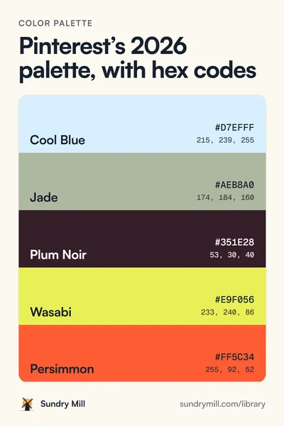
Pinterest Predicts 2026 named Poetcore a trend for the year, typewriter type included.
Free to use in personal and commercial work. No credit needed, though a link back is always nice.